
All the companies are in the graph now, but there was still something bothering me. The old industries have a lot of tangible assets (oil rigs, refineries, factories, inventories) and also some intangible ones (goodwill, software licences – sometimes also tangible). The new ones developed their platforms and infrasctructures but these assets were never “purchased” and therefore don’t have a fair market value. As a result these assets are not allowed to be in the balance and we end up with an “unfair market value”. Especially the new companies will miss lot of value. In Data is the new oil VIII I spent some attention to the subject and in between I went on searching.

Photo by Marcelo Chagas from Pexels
Finally I found a company taking care of this! Brand Finance published their Global Intangible Finance Tracker (GIFT TM). In this document the “undisclosed intangible assets” are estimated and published. Although most of the traditional companies like Shell or Toyota are not mentioned, ExxonMobil and Volkswagen are in. The former is missing out some intangible assets and the equity should be about 30% higher. The latter got a negative value, leading to a reduced value!
Yet this is nothing compared to the five tech-giants actually being the top five of the list: Microsoft, Amazon, Apple, Alphabet and Facebook. For those the real value of their intangible assets should be many times the value of the intangible assets in their balance-sheets!
The impact of this however, is very different for each company because of the differences in tangible assets. To obtain a more realistic balance-sheet for these five, I increased the total assets with the undisclosed intangible assets mentioned in the Brand Finance publication and subtracted the total liabilities to get the improved equity. The other companies were not changed so it’s probably not a completely fair comparison, but it illustrates the principle very well.
The new graph based on the additional information only holds one year: 2018. To see the impact of the correction, the uncorrected and corrected datasets were combined in one single graph. The uncorrected set is presented as an artificial year called “uncorrected”. The buildings for the “traditional” industries are unchanged, but the top five of the tech-giants is very different for the corrected and uncorrected row!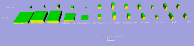
Double-clicking the screenshot will open the 3D-graph in your browser. Beware: thegraph haw so many companies that zooming out is necessary to see the whole picture! Clicking the right mouse-button and moving the mouse up and down at the same time, will zoom the graph in and out. For maniputalion of this 3D-graph: Clicking left while moving the mouse will tilt the graph in different directions. Double clicking in the graph translates it and readjusts the centre at the same time. Just try it – If you don’t know how to get the normal position back, refresh the page in your browser.
Looking at the revenue we have to accept that the old oil-companies are still selling the new oil. When looking at the shareholder value, our only conclusion can be: “yes, data is the new oil!”
This was the last post for the series. For more background on the 3D-graph generator, download our white-paper together with the 3D-graphs (html-format, available as zip). Or go to our website and download the free demo-package to try the 3D-graph generator yourself. New posts will be announced on Twitter: @AnRep3D and our Youtube-channel offers short explanatory movies on the 3D-graphs and the generator creating them.

Pingback: COVID-19 – we cannot ignore it. | Annual reports presented as 3D graphs