
Already the fourth company will be added to the graph! This time I wasn’t afraid to take a European company, although it meant I had to recalculate EUR to USD. Of course I had to extact the numbers from six Annual Reports first, but actually it was a pleasure to do so as these documents are well structured. Although the total set was way over a thouasand pages in total, a very good financial abstract was presented at the first pages after the introduction every time. The consolidated totals were taken, like the profit shown in the picture below.

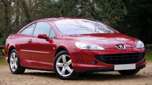
After this picture– probably boring for some people – it’s time for a legendary car from the PSA history. (Photo by skylark on Pixabay) 
Recalculating EUR to USD is always tricky. For the balance end of year rates will apply and for the revenue and profit the best option is the mid-year rate. I was a little bit lazy as I knew it was already done for another post some of the years. Then the missing years were derived from the same website with historical exchange-rates. Remember, I’m only showing the potential of our 3D-graph generator here, so don’t use my calculations for serious business purposes as you may have do it in a different way. Yet, the 3D-graph presented below will offer valuable insights.
(Photo by WikimediaImages on Pixabay) 
One detail I have to share. On generating the new 3D-graph, with PSA in it, I forgot to adjust the number of companies – again! After correction, I noticed the order was not a nice one, as the large “buildings” made the others invisible from several angles. PSA is somewhere in between GM and Ford (more or less equal size) and Mitsubishi, so I changed the order to: Mitsubishi, PSA, Ford, GM. This way it’s easier to get a good overview. No need to show you all the steps this time. It will do to explain the procedure was similar to the one in previous blogs. For more details about the spreadsheet and its calculations, just mail me. Below a screenshot of the graph is shown.
(clickable – see below for instructions about how to manipulate the real 3D-graph that will appear) 
All this was done in seconds by the way. Getting a nice picture of a relevant car takes more time than generating a new AnRep3D-graph! In this post I will present a couple of screenshots. Although you will be able to see the 3D-graph yourself, some explanation could be helpful.
 (Photo by educnormandie on Pixabay)
The graph holds a legend (or key) also in 3D, showing the variables presented in different directions.
The height of a building is the revenue and the green roof represents the profit. The thickness of the roof varies with the amount of profit and its relation to the total height gives an impression of the margin, e.g. 1%, 5% or 10% of the height of the building being roof. Of course profit could be negative (a loss) and in those cases the roof will be red. As the costs are higher than the revenue in these cases, the yellow part will show the revenue and the total height will represent the costs made to obtain this revenue. By the way: I was in a hurry when I entered Equity as just “Eq.”. This will be changed in an upcoming post.

(Photo by MarkThomas on Pixabay)
If we wouldn’t take the net profit but e.g. the EBITDA, a larger part of the building would be coloured. The legend or key will show what is in the graph. Don’t forget tot put the right labels in and to take the same variables for all companies!
The width of a building represents its Equity in this case and the depth shows the total Assets. This means the ratio of the floor shows indicates the gearing (using the total Liabilities instead of the total Assets would even be better to judge the gearing of course). The height (thickness) of the roof versus the width represents the Return on Equity. Total height compared to the depth shows the ratio of the revenue to the total Assets and so on. Of course any variable can be used for a direction, as long as it makes sense. In previous posts we presented the energy-mix for different countries in time, showing e.g. fossil fuels, nuclear energy and renewables in the three dimensions.
 (Photo by dimitrisvetsikas1969 on Pixabay)
Knowing what the graph shows, it’s time for some additional screenshots. If you double-click the picture, the real 3D-graph will appear in your web-browser (if Javascript and WebGL are enabled and assuming you are online).
 On double-clicking, the 3D-graph will appear in your web-browser. There are several options to move graph: clicking the right mouse-button, moving the mouse up and down will zoom the graph in and out. Clicking left and moving the mouse at the same time will tilt the graph in different directions (or move the observer’s viewpoint around a fixed graph – it’s relative of course). Double clicking in the graph translates it and moves the centre at the same time. As a result the way the graph tilts will change. Just try it. If you don’t know how to get the normal position back, just refresh the graph.
In the screenshot to the top, we see the 3D-graph from above. The years with profit and loss for the different companies are clearly visible! The screenshot to the bottom was turned around 180 degrees. Here we see GM started out with a loss in 2012, while Ford was making good profit. This is quite different from the situation in 2017, when both were doing well.
 (Photo by AutoPhotography on Pixabay)
For more information, please have a look at our other posts, our website or our youtube-channel . Again, the free 3D-graph generator package (zip) can be downloaded, unpacked in a folder and the .jar file can be started immediately.

Pingback: Automotive 10 – Nissan added, 3D-graph completed | Annual reports presented as 3D graphs